




Canada 2026 Match Home Authentic Jersey
StyleSports

Canada Unveils Les Rouges’ 2026 World Cup Kits in Fire & Ice

Reading Time: 6 minutes

Share via

Our team of editors and experts thoughtfully chooses each product. If you decide to buy through one of our links, we may earn a commission. Learn more. Want to know how we test products? Click here for more details.

Allez les Rouges! Only a few hours after U.S. Soccer revealed its Stars and Stripes jerseys, Canada Soccer and Nike gave the other North American co-host its turn in the spotlight. With Les Rouges preparing to play in a men’s World Cup on home soil for the first time, another routine red shirt would hardly have matched the occasion. Instead, the 2026 collection looks to the “True North,” pairing a fiery red home jersey and its oversized, north-pointing maple leaf with a black away kit covered in cracked ice and skate-blade details.

Unveiled on March 16, 2026, both jerseys use Nike’s new Aero-FIT cooling technology — something the players may appreciate when all that Canadian winter inspiration meets the heat of a North American summer. Les Rouges were scheduled to give the kits their first outings later that month against Iceland and Tunisia at BMO Field in Toronto, beginning the countdown to a World Cup that Canada would finally get to experience at home.

Canada 2026 Match Away Authentic Jersey
Canada 2026 Match Away Authentic Jersey | Image: Nike

Fire, Ice & Two Very Different Les Rouges Kits

Canada Soccer calls the campaign “Canada — Full Tilt,” an identity built around the authenticity, resilience and ambition of the True North. Nike translates that idea into two jerseys that share the maple leaf without looking like simple colour swaps — a bright red home kit that celebrates Canada’s national symbol and a black away kit inspired by the country’s frozen landscapes.

The home jersey is the more traditional of the two, placing an oversized split-tone maple leaf across its red base and pointing it north as a symbol of collective ambition and progress. The away jersey heads in the opposite direction — its black base is covered in grey, blue and white cracked-ice graphics, while a frozen maple leaf etched like a skate blade connects the design to Canada’s winter-sports heritage.

Both Match jerseys use Nike’s new Aero-FIT technology, combining open and closed mesh zones to lift the fabric away from the skin and deliver more than twice the airflow of the company’s previous performance materials. The graphics are knitted directly into the jerseys to preserve breathability, while the kits and accompanying training collection are made entirely from textile waste — useful technology for Les Rouges when the True North meets the heat of a North American summer.

Canada 2026 Match Home Authentic Jersey
Canada 2026 Match Home Authentic Jersey | Image: Nike
Canada 2026 Match Home Authentic Jersey
Canada 2026 Match Home Authentic Jersey | Image: Nike

The Maple Leaf Home Jersey

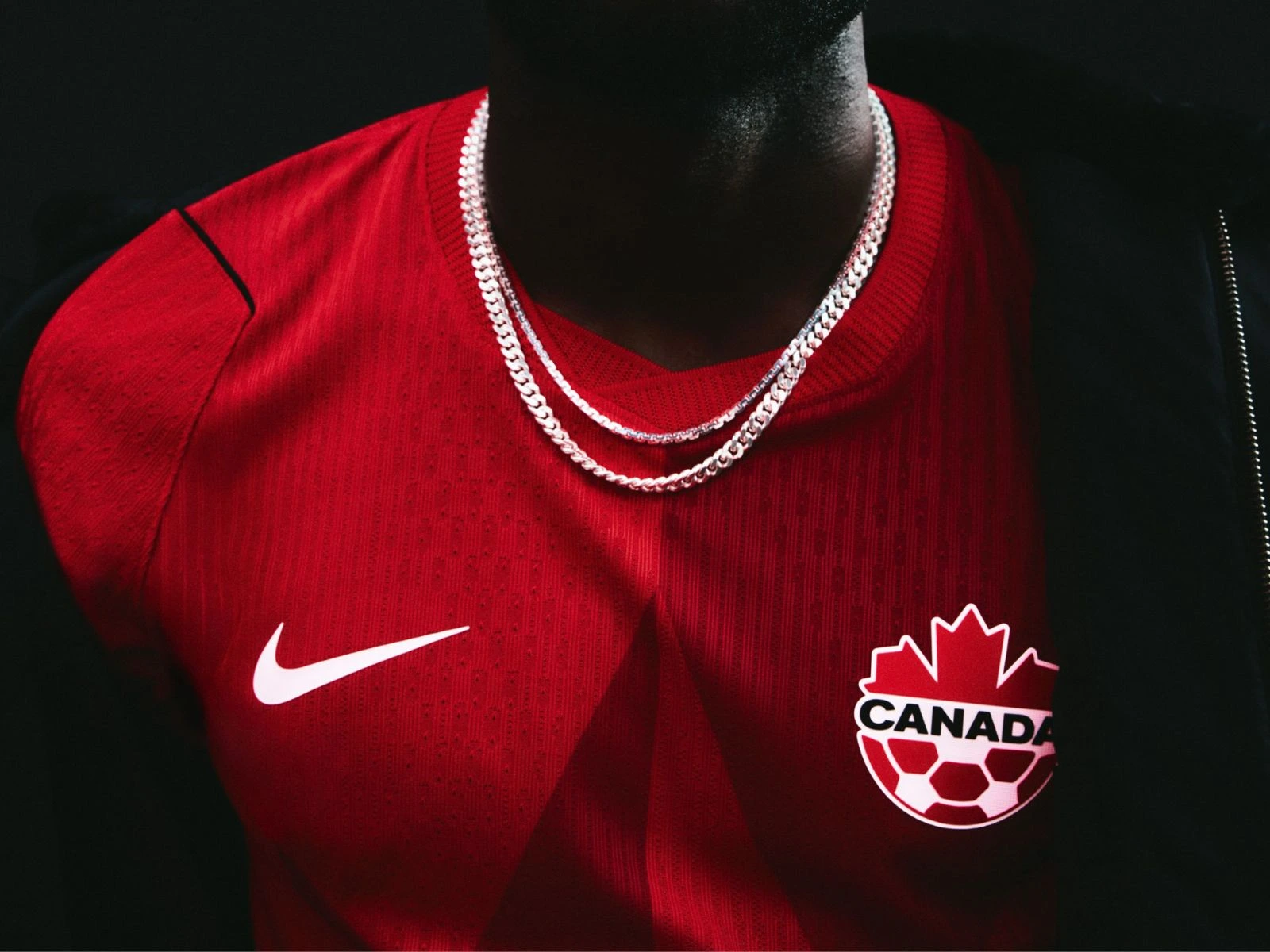
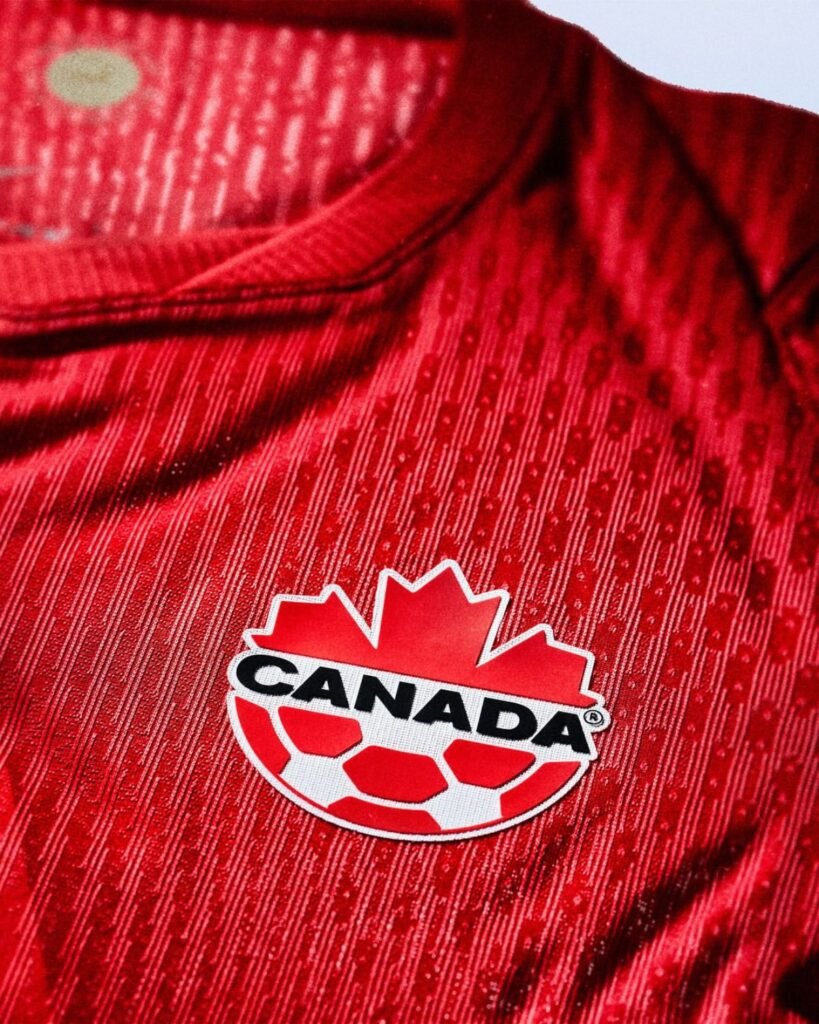
The home jersey takes Canada’s traditional red and gives it a much stronger focal point — an oversized, split-tone maple leaf stretching across the front of the shirt. Its centre runs vertically through the body while the upper point faces north, turning the country’s most recognizable symbol into a statement of unity, progress and the direction Les Rouges hope to follow on home soil. White details on the Nike Swoosh and Canada Soccer crest provide a clean contrast, while subtle touches inspired by Canadian outdoor apparel reinforce the durability and precision behind the design.

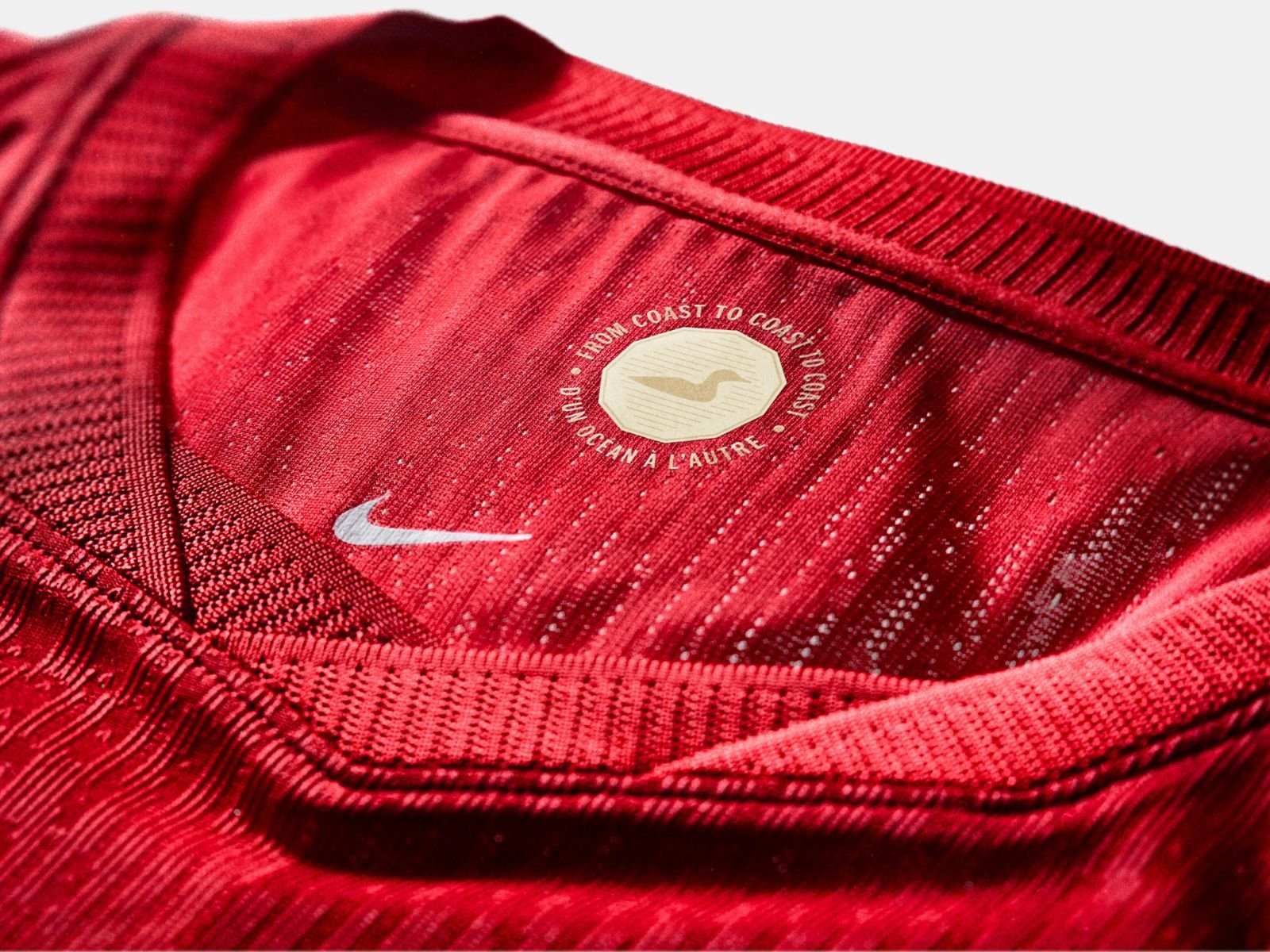
Hidden inside the collar is an embossed “Lucky Loonie” emblem surrounded by the words “From coast to coast to coast.” The detail recalls the Canadian one-dollar coin secretly buried beneath centre ice at the 2002 Winter Olympics, where Canada went on to win gold in both the men’s and women’s hockey tournaments. Hiding an actual coin beneath a World Cup pitch might be difficult, so carrying its good-luck story inside every jersey seems like the more practical option.

Canada 2026 Match Away Authentic Jersey
Canada 2026 Match Away Authentic Jersey | Image: Nike

The Cracked-Ice Away Jersey

Canada’s away jersey could not be more different from the red home kit. Nike covers its black base in broken grey, blue and white graphics that look like cracks spreading across a frozen surface, with thin red panels along the sides providing one of the few reminders that this is still Les Rouges. Another maple leaf is worked into the pattern with edges inspired by the lines left by a skate blade — a smart reference to the country’s winter-sports history and a fitting way for Canada to bring some ice into a summer World Cup.

Canada head coach Jesse Marsch described the jerseys as a reflection of the people and communities behind the team, saying, “There’s a real pride in representing Canada. Our players understand the moment in front of us, including a World Cup at home and an entire country behind us. When we put this jersey on, it represents every place and every community that helped build The People’s Team. We take this responsibility seriously.”


Canada 2026 Match Away Authentic Jersey
Canada 2026 Match Away Authentic Jersey | Image: Nike
Canada 2026 Match Home Authentic Jersey
Canada 2026 Match Home Authentic Jersey | Image: Nike

Canada’s 2026 World Cup Jerseys Price & Availability

Canada’s home jersey was released in Nike’s authentic Match and more affordable Stadium versions, while the black away kit was offered to supporters as a Stadium replica. The Match home jersey uses the same lightweight Aero-FIT construction worn by Les Rouges, while both Stadium shirts switch to sweat-wicking Dri-FIT fabric and a more relaxed fit. Nike also released a loose-fitting Hollywood goalkeeper shirt in black, red and white.

Launch prices through Nike were as follows:

The collection went on sale in Canada through Nike, the official Canada Soccer Store and participating retailers on March 16, 2026, followed by its wider international release on March 23. Prices and stock may have changed since launch, particularly for the Match jersey and popular sizes, so supporters may need to move almost as quickly as Alphonso Davies if they want a specific version.

Fire at home, ice on the road — Allez Les Rouges, let’s go Canada!
Canada 2026 Match Home Authentic Jersey
Canada 2026 Match Home Authentic Jersey | Image: Nike
Canada 2026 Match Away Authentic Jersey
Canada 2026 Match Away Authentic Jersey | Image: Nike

NikeFIFACanada
About the Author

Related Articles

Watches

Blancpain x Swatch Dive Deeper with the New Bioceramic Scuba Fifty Fathoms ‘Green Abyss’

Reading Time: 4 minutes

Our team of editors and experts thoughtfully chooses each product. If you decide to buy through one of our links, we may earn a commission. Learn more. Want to know how we test products? Click here for more details.

  • Blancpain and Swatch expand their dive lineup with the ocean-coloured Bioceramic Scuba Fifty Fathoms ‘Green Abyss,’ priced at USD $420.
  • The 42.3mm model features the automatic SISTEM51 movement with a 90-hour power reserve in a lightweight Bioceramic case.
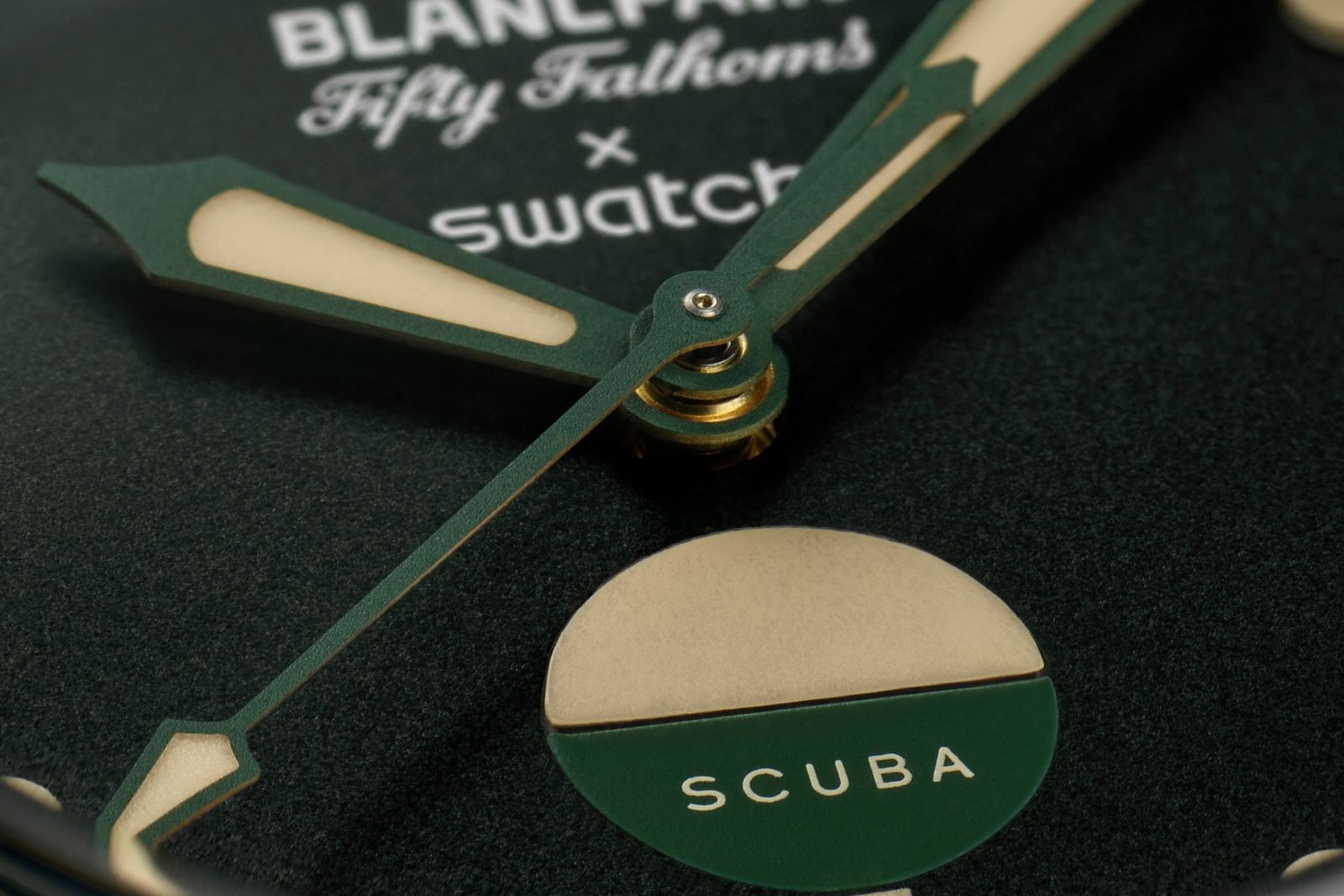
  • A vintage-inspired bi-colour water contact indicator replaces the date window, emphasizing the watch’s connection to classic MIL-SPEC dive heritage.
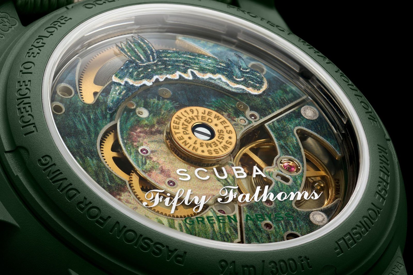
  • The caseback showcases a vivid illustration of the Felimare picta, also called the “Regal Sea Goddess,” continuing the collection’s marine storytelling theme.

Blancpain and Swatch return with the newest addition to their Bioceramic Scuba Fifty Fathoms lineup, unveiling the ocean-inspired ‘Green Abyss’ as the latest evolution of their unlikely yet successful collaboration. Priced at USD $420 and available from June 7th, 2025, the new release continues to bridge serious dive-watch heritage with Swatch’s modern, accessible twist.

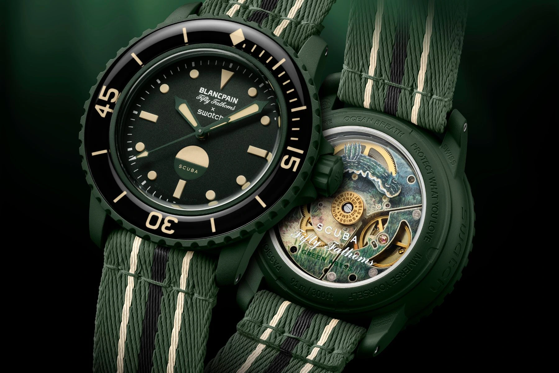
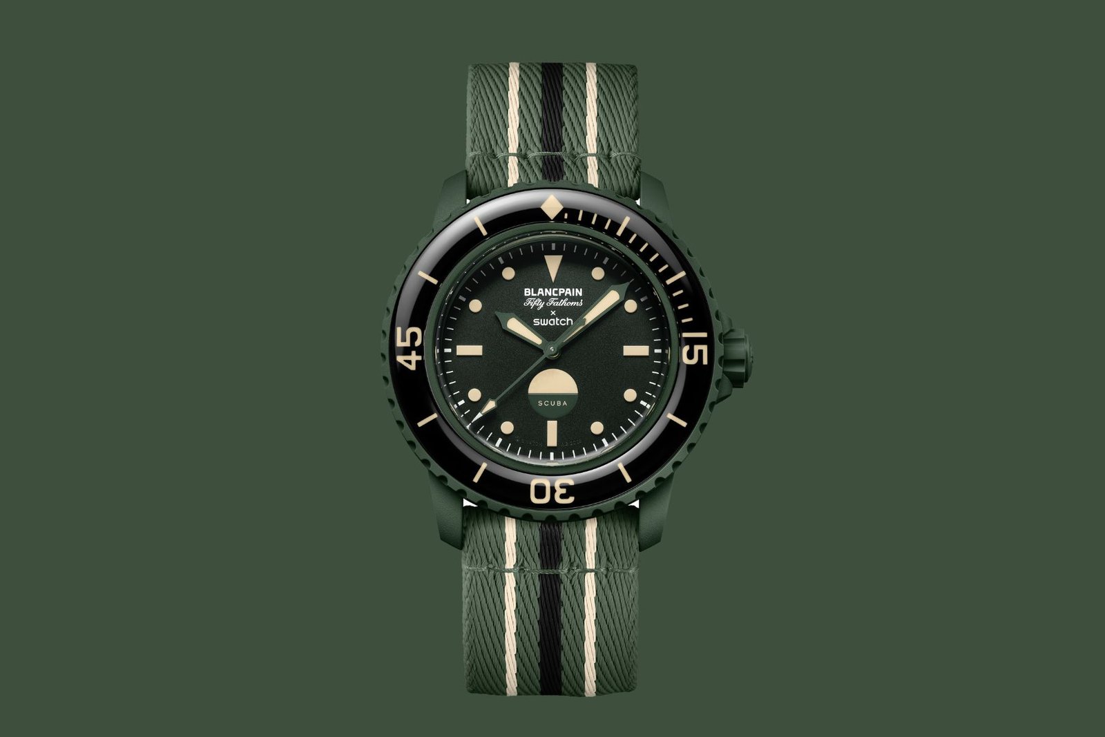
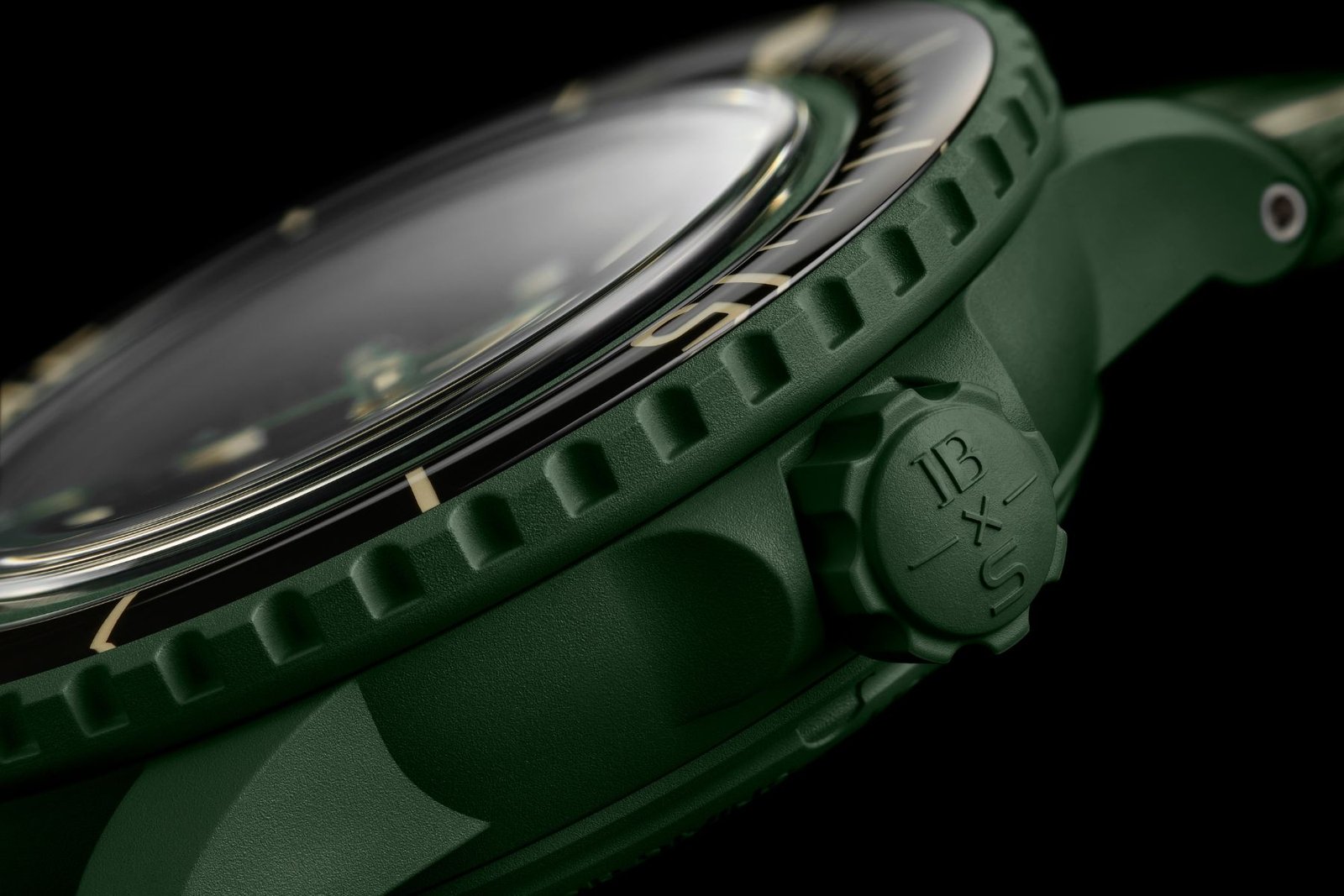
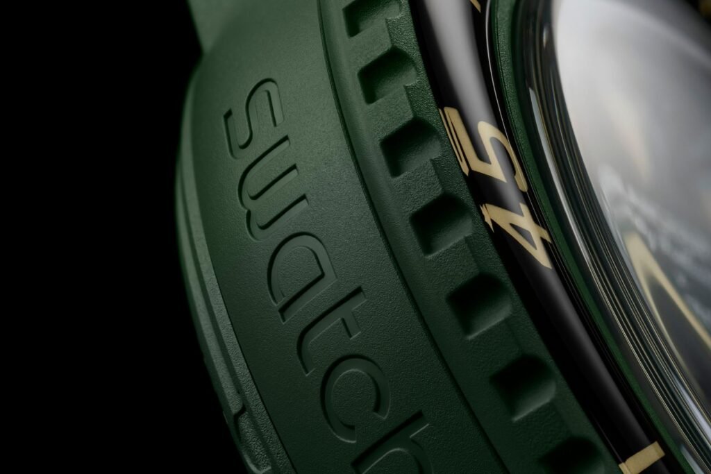
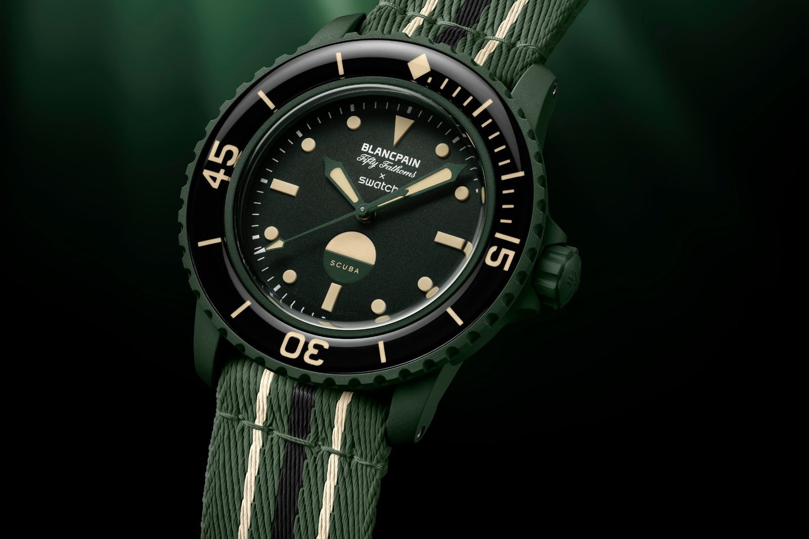
Sized at 42.3mm and powered by the automatic SISTEM51 movement, the ‘Green Abyss’ arrives in rich aquatic tones true to its name. A deep green Bioceramic case, matching bezel, and crown establish its underwater identity. The dark dial and bezel insert enhance the moody, sub-sea aesthetic. Vintage-toned lume and a marine-inspired caseback illustration complete the story. This latest drop feels like a confident refresh for a collection that continues to carve out its own lane.

Blancpain x Swatch Bioceramic Scuba Fifty Fathoms ‘Green Abyss’ | Image: Swatch

Blancpain x Swatch Bioceramic Scuba Fifty Fathoms ‘Green Abyss’ Specifications:

  • Diameter: 42.3 mm
  • Thickness: 14.4 mm
  • Lug-to-lug: 48.0 mm
  • Case material: Green Bioceramic
  • Caseback: Digital print – Felimare Picta Nudibranch
  • Crown: Bioceramic – Green
  • Bezel: Unidirectional – Black Resin Insert
  • Movement: Swatch SISTEM51 Automatic
  • Power reserve: 90 Hours
  • Water resistance: 9 Bar (91 metres, 300 feet)

Like the previous models in the collection, the ‘Green Abyss’ keeps the ocean story alive on the caseback, this time featuring a full-colour digital illustration of the Felimare picta, better known as the Regal Sea Goddess nudibranch. Done in rich, seaweed-inspired tones, the marine creature adds character to the watch without feeling gimmicky, emphasising that this collaboration has always been about more than just colours — it’s about honouring the underwater world that originally inspired the Fifty Fathoms.

There is also a subtle but significant change on the dial. Instead of a conventional date window, the ‘Green Abyss’ features a dual-color water contact indicator at 6 o’clock, intended to detect moisture and subtly reference vintage MIL-SPEC dive watches. This detail will be instantly recognized by experienced collectors, as it emphasizes the watch’s tool-watch heritage over modern features.

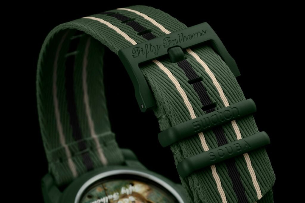
The strap has also evolved. Swatch shifted from the original single-pass NATO style to a two-piece fabric strap, called “NATO Style,” as seen in the Pink Ocean and Blue Lagoon releases. Although it isn’t a traditional NATO in its pure form, the two-piece design offers greater ease and comfort for everyday wear, which is more important when the watch is on your wrist than when it’s in a display box.

Blancpain x Swatch Bioceramic Scuba Fifty Fathoms ‘Green Abyss’ | Image: Swatch

Apart from these updates, the watch’s core design stays true to what fans of the collection expect. The ‘Green Abyss’ is powered by Swatch’s SISTEM51 automatic movement, which offers a 90-hour power reserve and genuinely enhances the mechanical credibility of the collaboration. The movement is housed within the brand’s signature Bioceramic case and maintains a water resistance of 91 metres/300 feet, ensuring the dive-watch theme remains strong.

When you flip the watch over, the caseback along the SISTEM51 becomes fully visible, offering wearers a clear view of the movement’s unique, minimalist construction. Shared in that space is the now-iconic marine illustration, once again highlighting the Felimare picta. Although technically classified as a soft-bodied marine gastropod mollusc, its translated name, “Regal Sea Goddess,” better matches the dramatic underwater theme of this release.

The Blancpain x Swatch Bioceramic Scuba Fifty Fathoms ‘Green Abyss’ is scheduled to launch on June 7th, 2025, at select Swatch boutiques worldwide. Given the momentum from previous editions and the steady demand for this collaboration, the watches are unlikely to remain available for long and will be limited to one per person per boutique, which seems fitting for a release rooted in dive heritage and collaborative hype.

Blancpain x Swatch Bioceramic Scuba Fifty Fathoms ‘Green Abyss’ | Image: Swatch

CollaborationsSwatchBlancpain
About the Author
arrow_drop_up